Case 04 · Spread 07
SOLING
Czech B2B catalogue · Paper cups & custom print
Making a practical B2B catalogue clear, visual and easy to navigate.
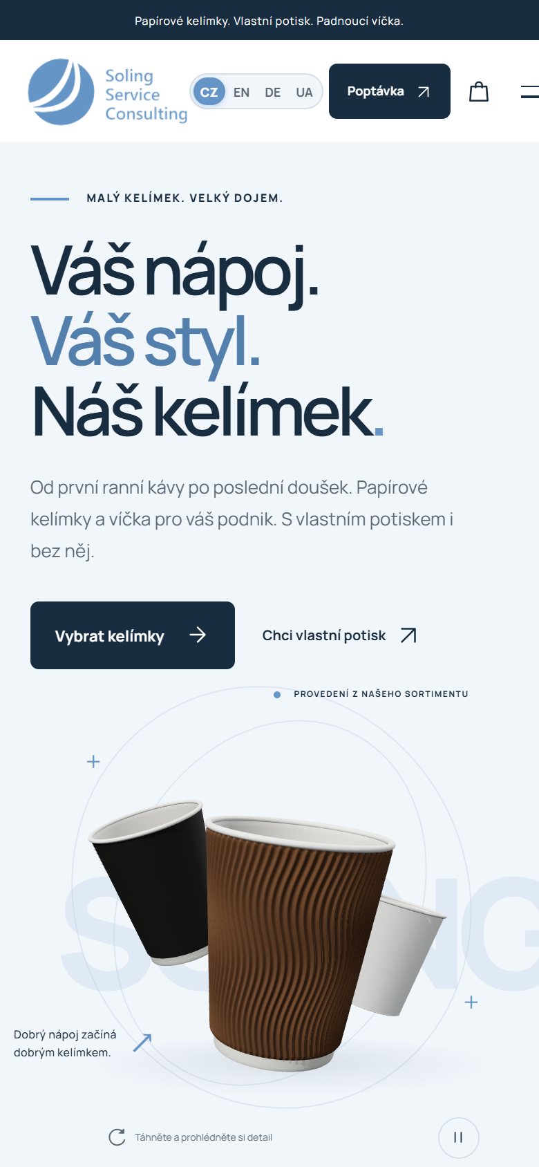
Wall types and finishes named the way buyers think, shown side by side — selected: Termo WRAP.
Wall type and finish, shown side by side, so near-identical variants become easy to tell apart.
Context
SOLING supplies paper cups, lids and custom-printed cups to cafés and businesses in the Czech Republic. Buyers compare variants and print options before they ask for a quote.
Challenge
A practical product with many near-identical variants. Business customers need to see the differences quickly and get from “which cup?” to “print our logo on it” without friction.
My contribution
- Product structure and taxonomy of the catalogue
- Catalogue UX — browsing, comparing, choosing
- The custom-print order and inquiry flow
Approach
- Name variants the way buyers think: wall type and finish, shown side by side.
- One clear path: range → catalogue & price list → custom print → inquiry.
- Product visuals large and honest; text short and practical.
What was delivered
- Catalogue structureCups, lids and variants in a taxonomy built for comparison.
- Custom-print journeyFrom a chosen cup to a print inquiry.
- Catalogue UXVisual browsing with the price list one click away.
What it shows
In B2B, clarity is persuasion: the faster a buyer understands the range, the sooner they ask for a quote.
- Termo WRAP
- Double wall
- Kraft
- White
- CZ / EN / DE / UA
In motion